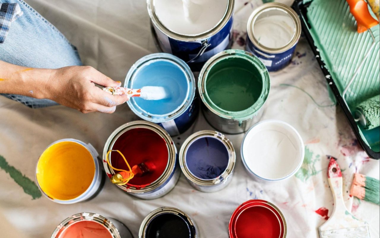
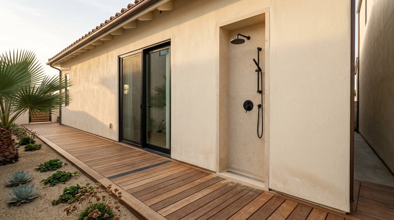
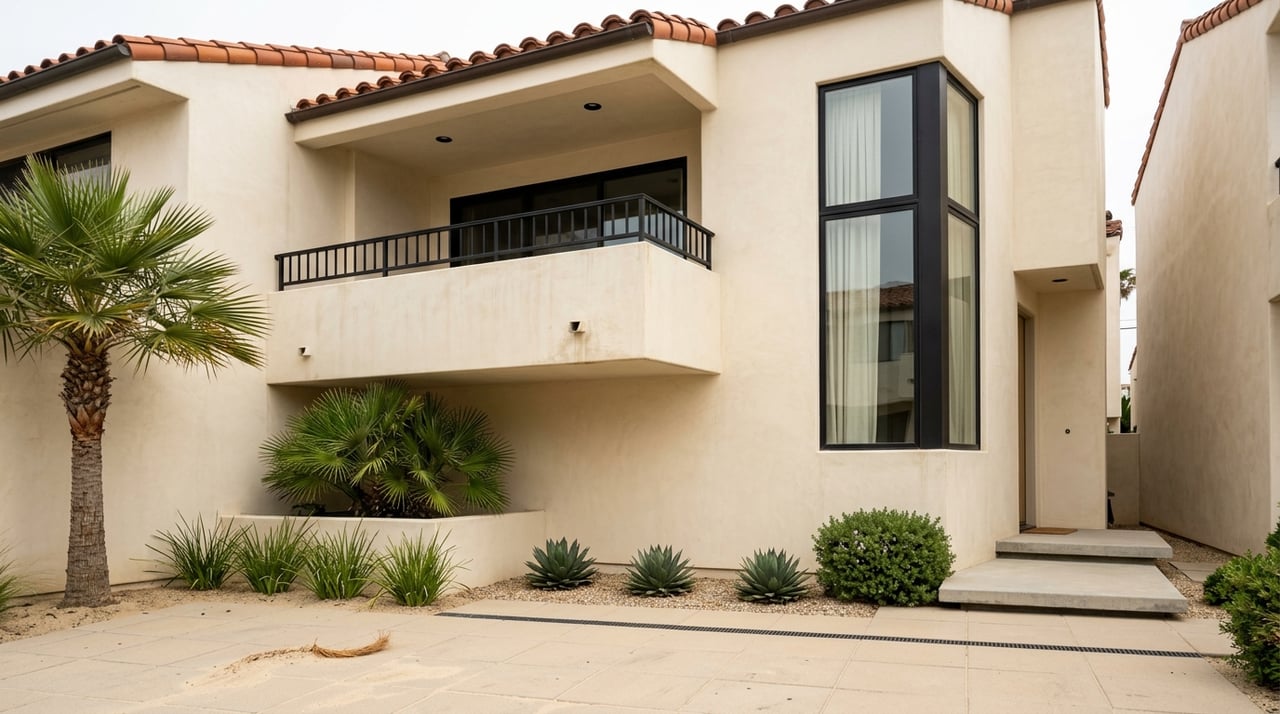
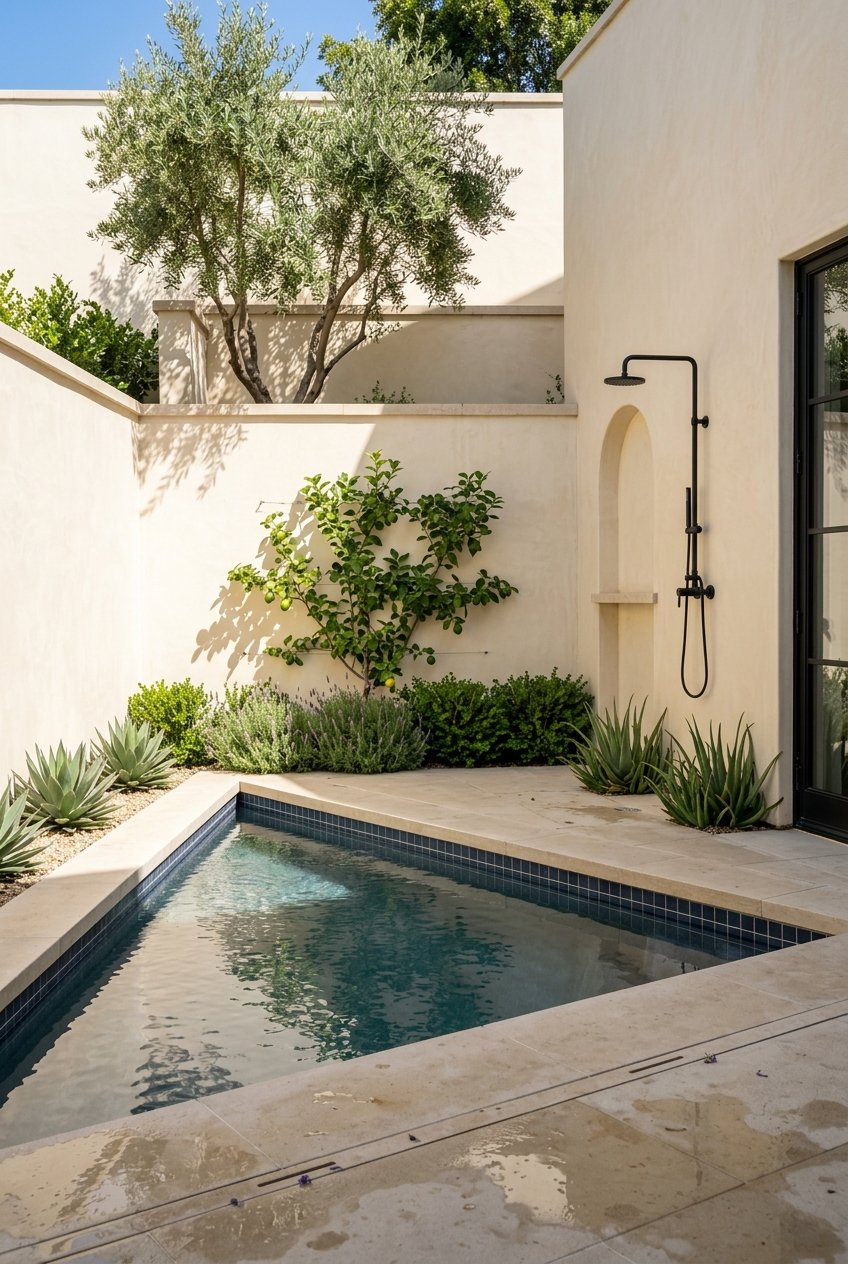
Choosing the right paint colors for your home is more than just a matter of style—it's a decision rooted in psychology, lighting, and spatial perception. The science of color can influence how we feel in a space, how large or intimate a room feels, and how each room functions in daily life. For Ventura homeowners, where natural light and coastal settings are major design elements, color choice plays a vital role in creating balance and comfort. Whether you're renovating a beach bungalow in Pierpont Bay or updating a family home in Midtown Ventura, here’s how to select paint tones that support both aesthetics and atmosphere—room by room.
Understanding the Basics of Color Psychology
Color impacts how we perceive space and how we feel within it. Warm tones like red, orange, and yellow tend to energize and stimulate, while cool tones like blue, green, and gray evoke calm, focus, and relaxation. Neutrals—white, beige, taupe—provide flexibility and a sense of openness, while darker hues can offer drama or intimacy, depending on how they’re used.
In Ventura’s sunlit homes, especially those with views of the ocean or mountains, natural lighting already plays a strong role in shaping the interior. Paint choices should complement that light, not compete with it. Keep in mind:
- North-facing rooms receive cooler light and benefit from warm undertones.
- South-facing rooms receive bright, warm light and can handle cooler or darker shades.
- East-facing rooms have soft morning light, making warm neutrals and soft yellows ideal.
- West-facing rooms glow in the evening, which enhances warm and bold tones.
Living Room: Creating Warmth and Connection
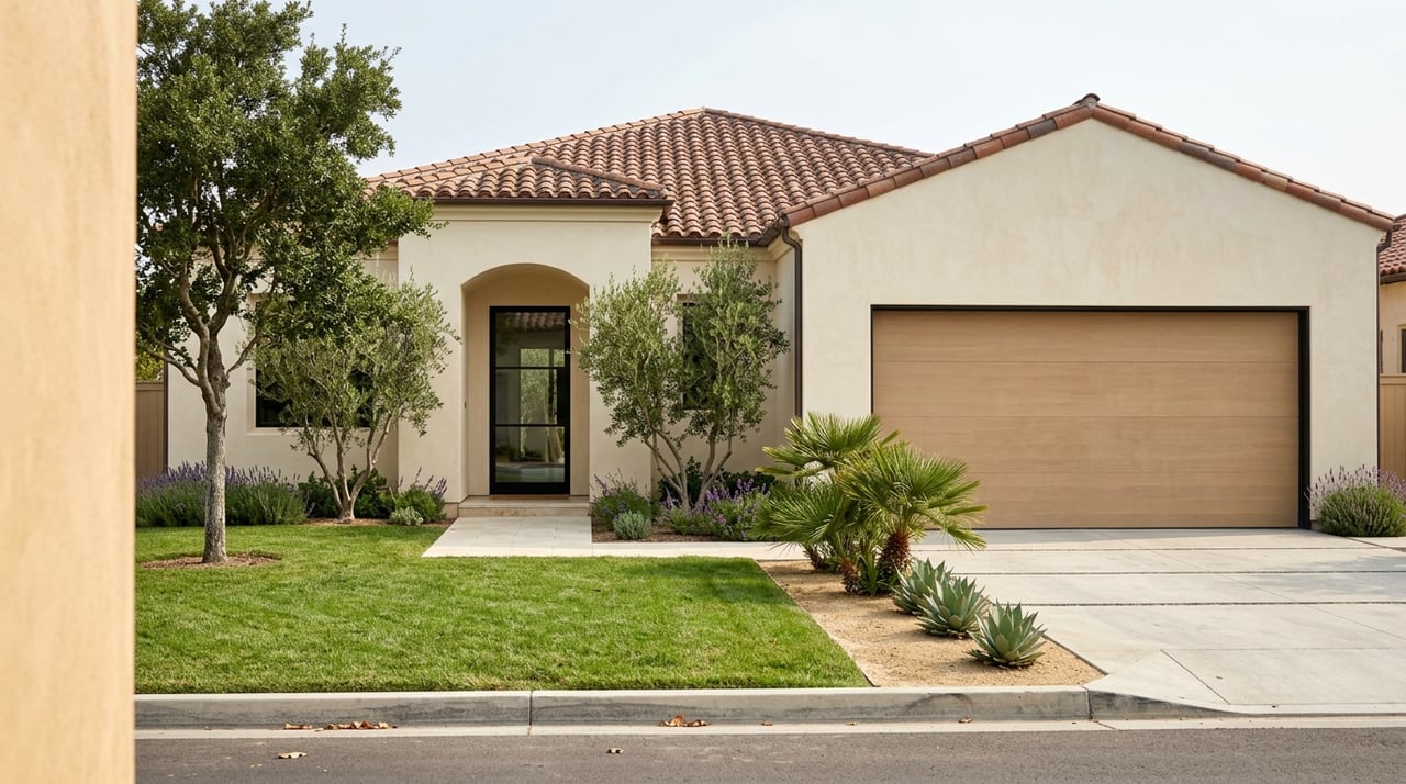
The living room is the social center of most homes and should reflect both comfort and style. In Ventura, living rooms often feature large windows, open layouts, and indoor-outdoor access, so paint colors should harmonize with the natural light and surrounding landscape.
Best tones: Warm neutrals like soft taupe, creamy beige, and muted greige work beautifully here. For a modern coastal aesthetic, consider shades like pale sand, warm white (with yellow or pink undertones), or even sage green for a nature-inspired feel.
Avoid overly stark whites in large, sunny rooms—they can feel clinical or glare-prone when natural light is abundant. Instead, opt for off-whites or colors with soft undertones to diffuse the light.
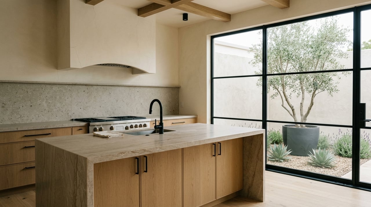
Kitchen: Inviting, Bright, and Functional
Kitchens require a balance of energy and clarity. The right paint color can create a clean backdrop that complements cabinetry, countertops, and tile without overwhelming the space. Since Ventura homes often incorporate open-concept kitchens, paint choices should flow naturally from adjacent living or dining areas.
Best tones: Soft whites with warm undertones, light grays, and warm greiges are versatile and timeless. For a subtle pop of color, consider pale blue, sage, or even a dusty rose accent wall, especially in breakfast nooks or island seating areas.
For beach homes in Pierpont Bay, colors that echo sea glass, driftwood, or sun-bleached shells integrate beautifully with the surroundings and offer a timeless look that feels tailored to the coast.
Dining Room: Balancing Mood and Sophistication
Dining rooms are an opportunity to introduce deeper tones that set a mood. In Ventura’s more traditional homes or formal dining spaces, rich colors can create an elegant backdrop for entertaining. In more casual, coastal-style homes, softer hues keep the room relaxed and bright.
Best tones: Moody blues, charcoal, navy, or deep green work well for dramatic, cozy dining spaces—especially when paired with white trim and metallic fixtures. For a lighter, more relaxed feel, try warm grays or earth-inspired terracotta.
Lighting matters here: rooms with ample natural light can support darker tones without feeling enclosed. In homes with less natural light, mid-tones like warm putty or dusty lavender can strike a balanced tone without darkening the space.
Bedrooms: Calm, Restful, and Personal
Bedrooms should be soothing, restorative, and aligned with personal preferences. Cool tones tend to work best here, as they support relaxation and sleep.
Best tones: Soft blues, pale greens, lavender, and warm grays are ideal choices. In Ventura’s hillside neighborhoods or homes with views, these shades enhance the serenity of the surrounding landscape.
For primary suites, a deeper version of these tones—like slate blue or forest green—can add depth without overstimulating. For children’s rooms, consider dusty pastels that feel fresh but can evolve with changing tastes.
Bathrooms: Crisp, Clean, and Bright
Bathrooms benefit from light, reflective colors that evoke cleanliness and freshness, especially in smaller spaces. However, Ventura’s relaxed, coastal influence gives homeowners permission to move beyond stark white.
Best tones: Pale blue, aqua, soft gray, and warm white all work beautifully. These colors mimic the feel of spa environments or ocean settings. For a more modern look, consider dark, moody hues like navy or charcoal in a powder room—especially when paired with brass or matte black fixtures.
Tile, natural stone, and metal finishes should all be considered when choosing a paint color that complements rather than clashes.
Home Office or Study: Focused and Intentional
With more homeowners working from home, the home office or study has become a priority space. Paint colors here should support concentration, minimize distraction, and provide a professional backdrop for virtual meetings.
Best tones: Muted blues, dusty greens, and mid-tone grays foster calm and focus. Neutral tones like greige or putty also work well, offering flexibility for different décor or work setups.
If the office is a multipurpose space, such as a guest room or den, a two-tone wall or an accent color can help define zones without overwhelming the room.
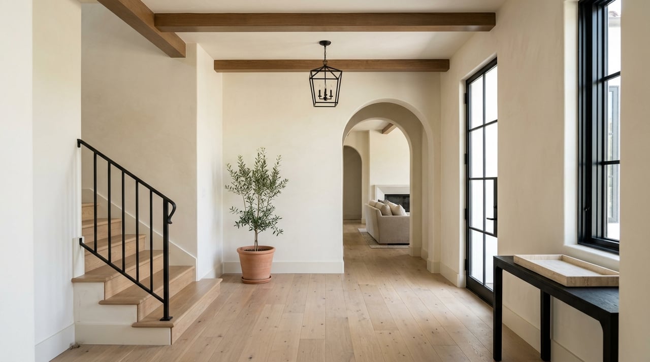
Hallways and Transitional Spaces: Seamless Flow
Hallways, stairwells, and entryways are often overlooked, but the right paint color ensures they serve as visual connectors between rooms. These spaces benefit from neutral tones that reflect light and provide cohesion.
Best tones: Soft whites, pale gray, or muted beige are ideal for creating a sense of openness. In homes with artwork or gallery walls, a cooler backdrop helps highlight the pieces. If your home has architectural features like molding or archways, paint can be used to subtly enhance these details without drawing too much attention.
Final Tips for Choosing the Right Color
- Test before committing: Paint a sample on multiple walls and observe how it changes in different lighting throughout the day.
- Coordinate undertones: Choose colors with similar undertones—warm with warm, cool with cool—to create a consistent flow.
- Factor in fixed finishes: Flooring, countertops, cabinetry, and trim color all affect how a paint color will appear in your space.
- Use flat or matte finishes for walls, eggshell or satin for high-traffic areas, and semi-gloss for trim and bathrooms.
Elevate Your Home With Color That Lasts
In a coastal city like Ventura, where lifestyle and environment shape how people live, paint color becomes a powerful tool in creating a home that’s both beautiful and functional. From sunlit kitchens to serene bedrooms, the right tones enhance your space and reflect your personal style.
For more guidance on preparing your Ventura home for sale—or selecting design updates that add long-term value—
contact Larry Krogh and Ignacio Anzaldo today. Their experience in the Ventura market ensures your home looks and feels its best, whether you’re staying long-term or planning your next move.